Inspiration, Influence and Innovation

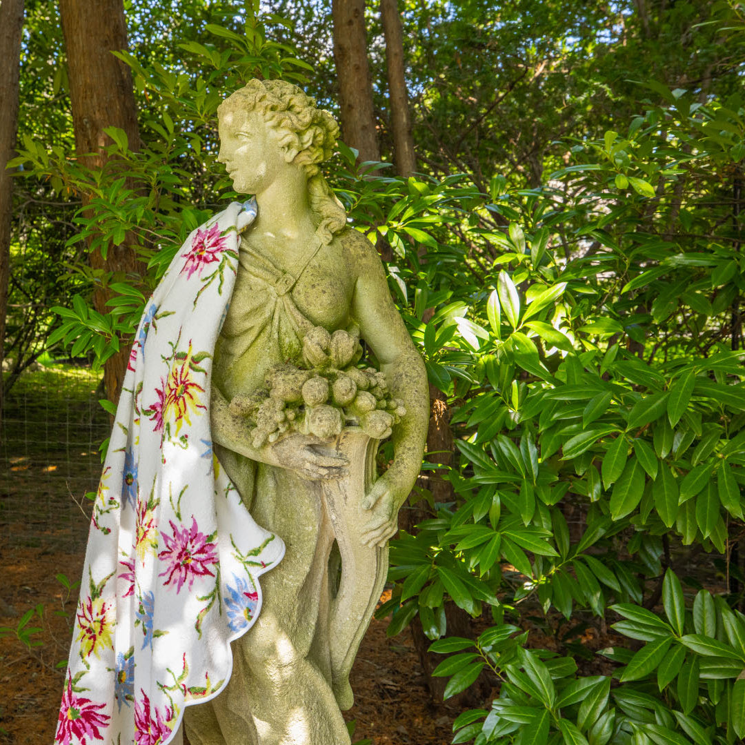
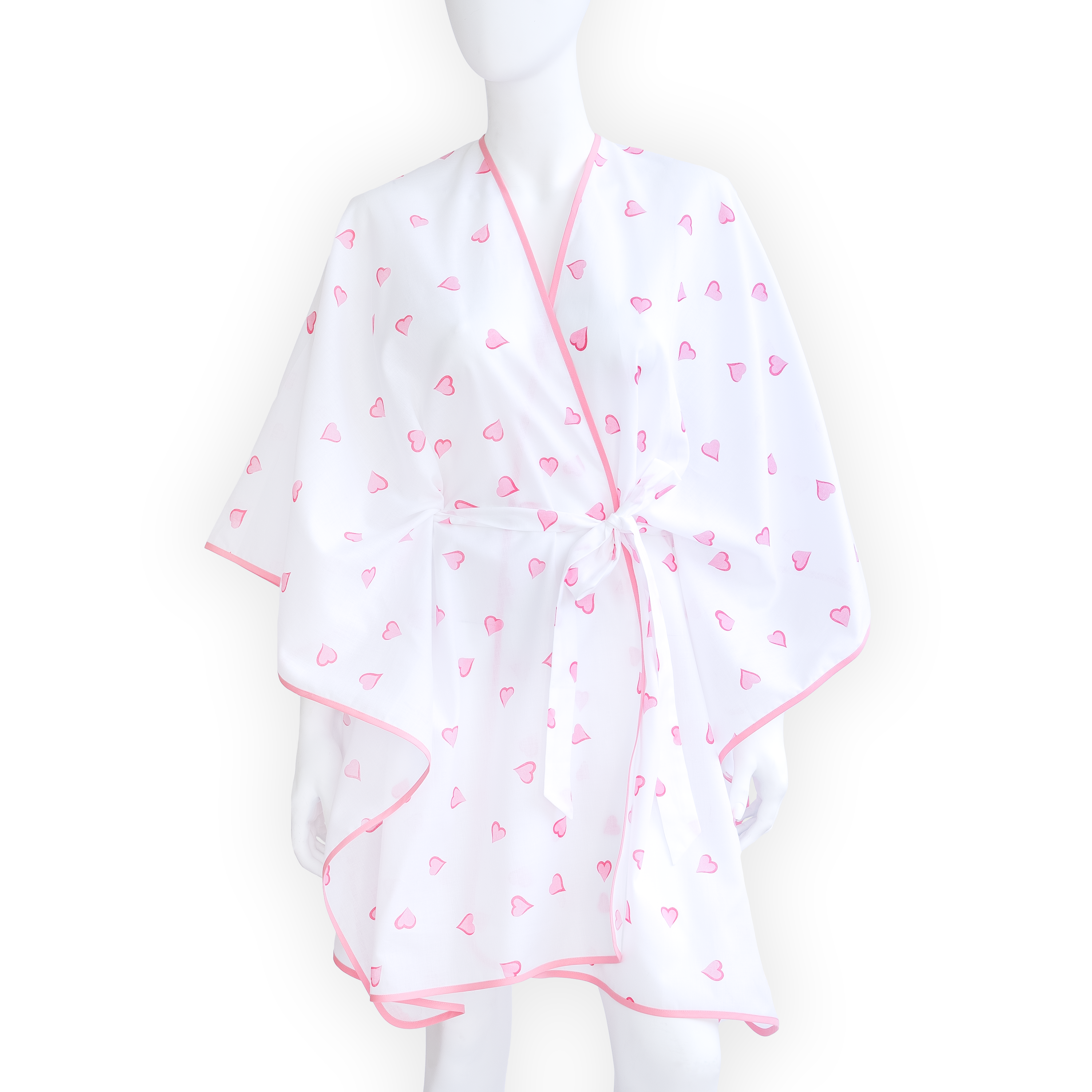
Nature inspired Madeleine Porthault’s designs ~ first painted on lingerie and later printed on her fine linens for the bed and table.
Madeleine and Daniel Porthault’s home outside of Paris, with doors and windows opening onto a vista of trees and flowers, visually brought their grounds inside of every room. Madeleine sought to reflect the continuous yet changeable beauty of her garden in her designs. She worked to blend and balance nature’s colors and shapes within her prints, and she instructed her designers to capture the landscape’s gentle breeze in the movement of their lines.
Madeleine was artistic and was also inspired by the artists of her day, especially the Impressionists and Colorists who were experimenting with natural forms, fluid lines and expressive colors. She visited Monet’s garden at Giverny and was equally captivated by the art of Dufy, Cezanne, Chagall and Matisse – the latter of whom had a home near the Porthaults’ weaving factory in northern France.
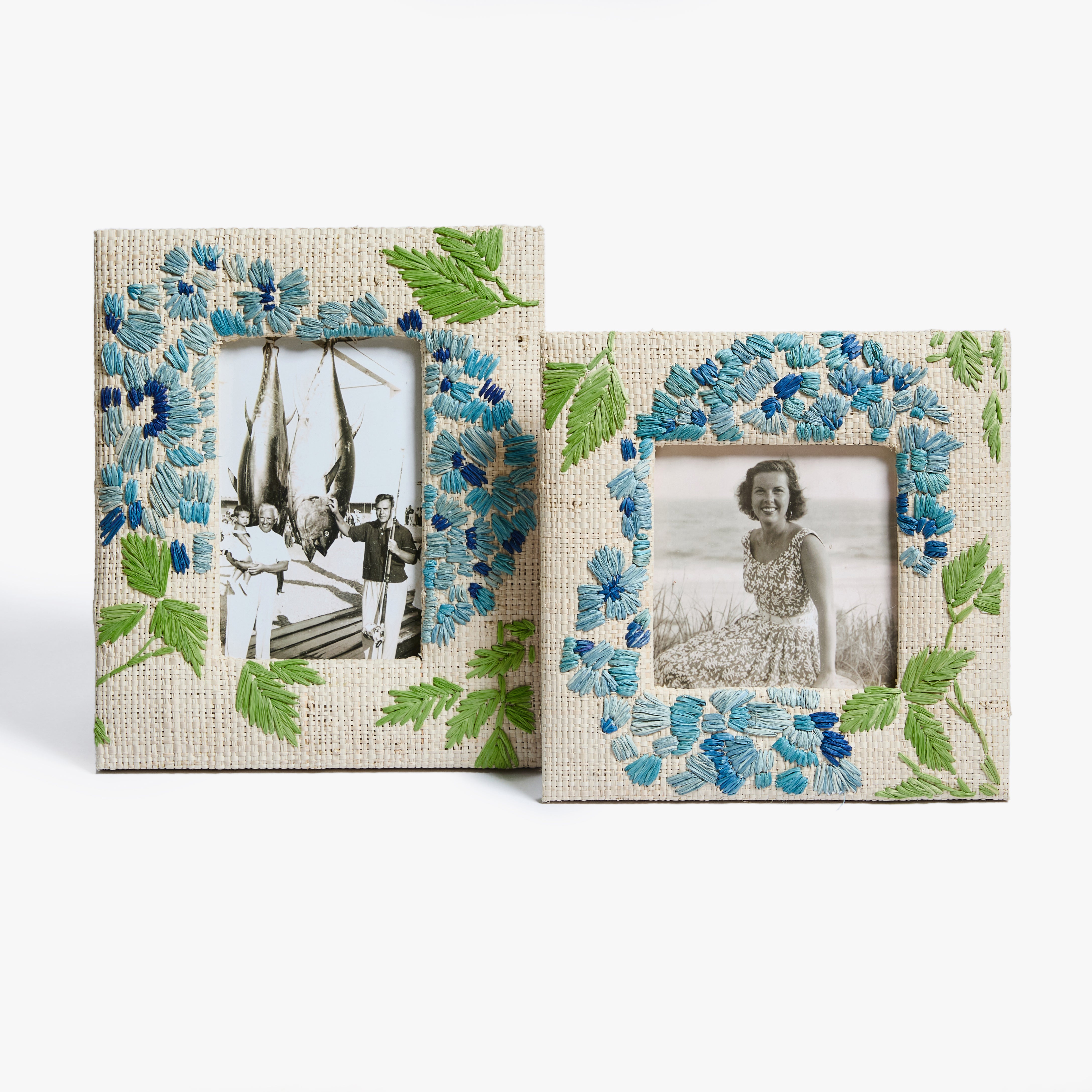
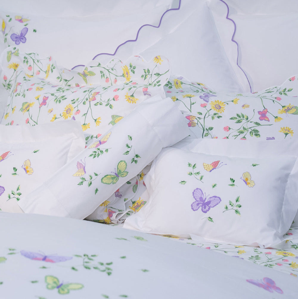
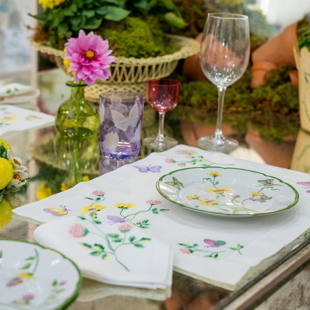
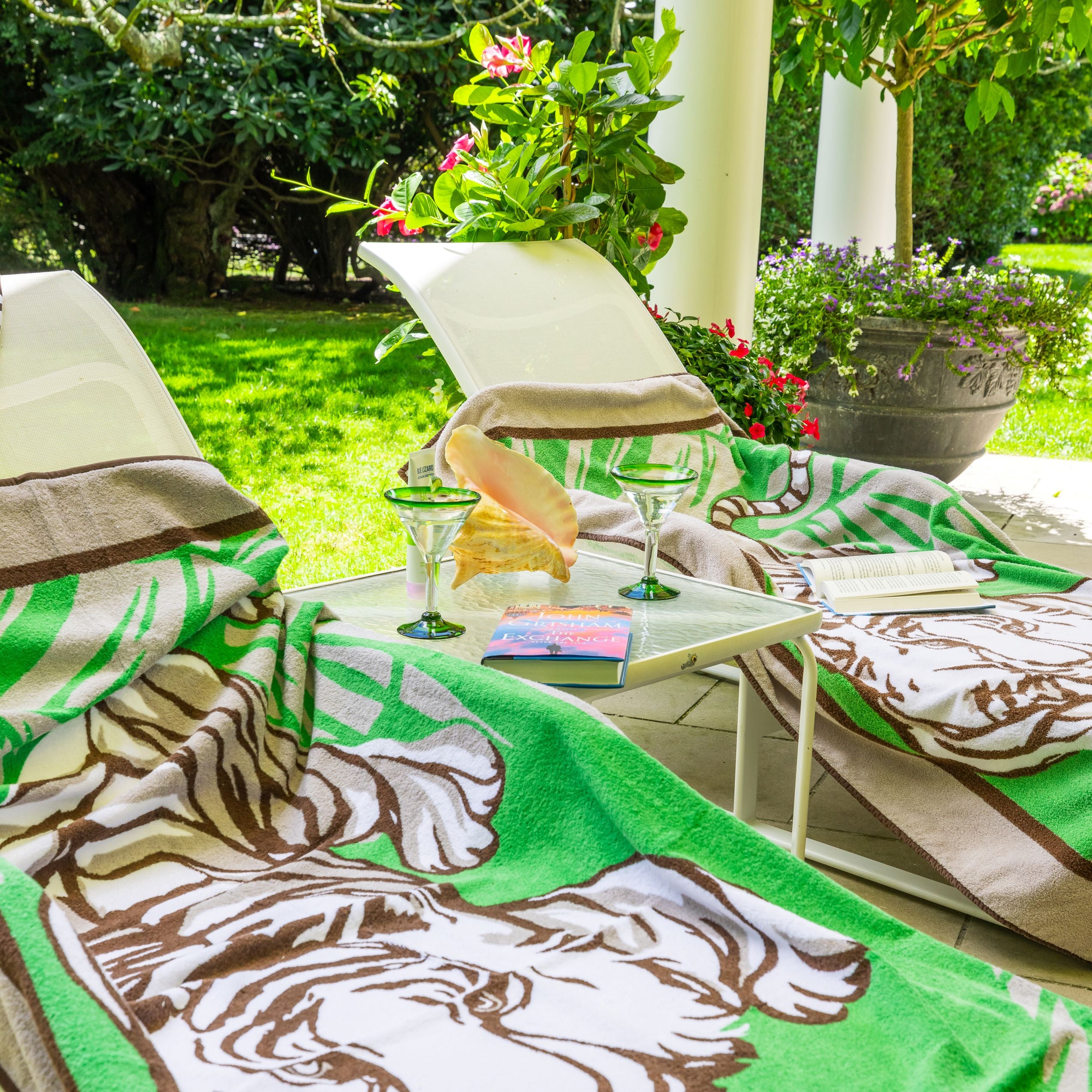
Innovative and creative, the Porthaults were the first to introduce prints into the world of home linens. Madeleine Porthault also encouraged the mixing of designs. Layering prints added dimension, variety and life, whether to a bed or a table. Linen expressions could change with the seasons and yet always remain unique to the client. This concept transformed the world of couture linens – now luxury could be both personalized and filled with personality, sometimes serious, sometimes whimsical, but always singular.
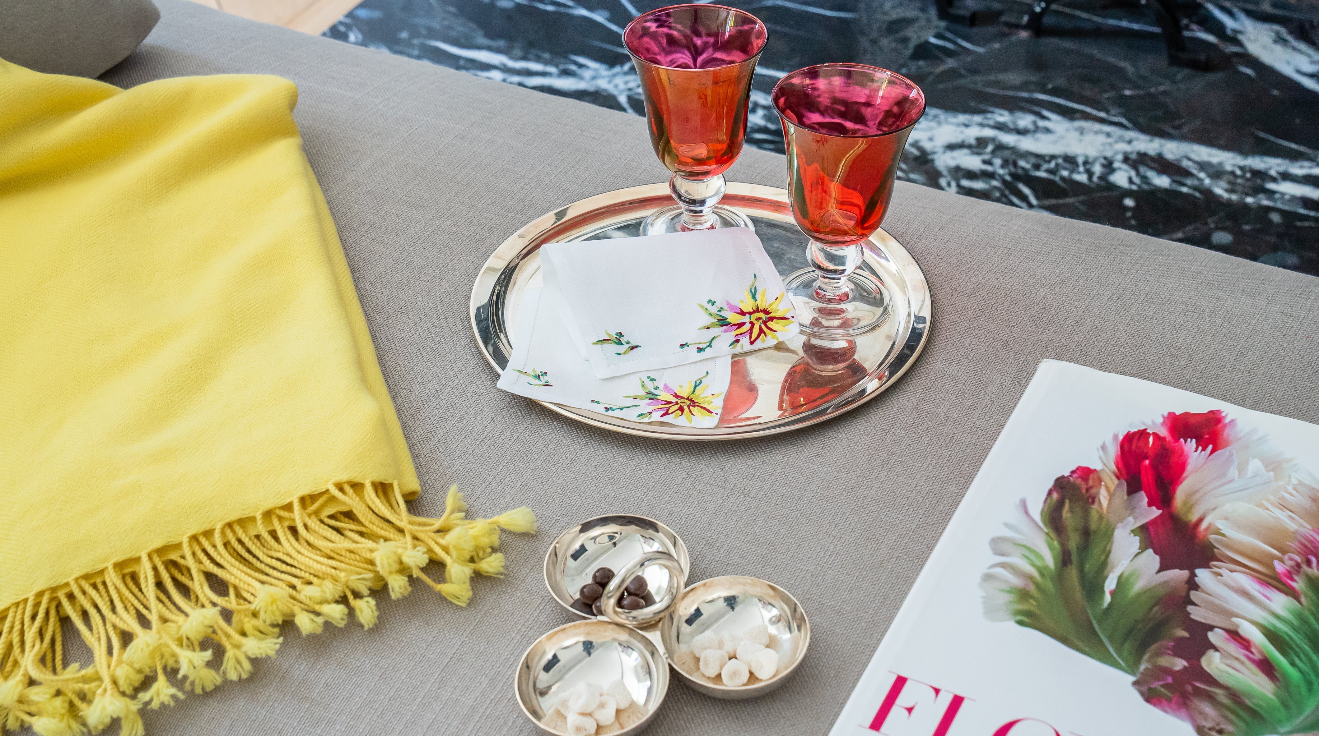
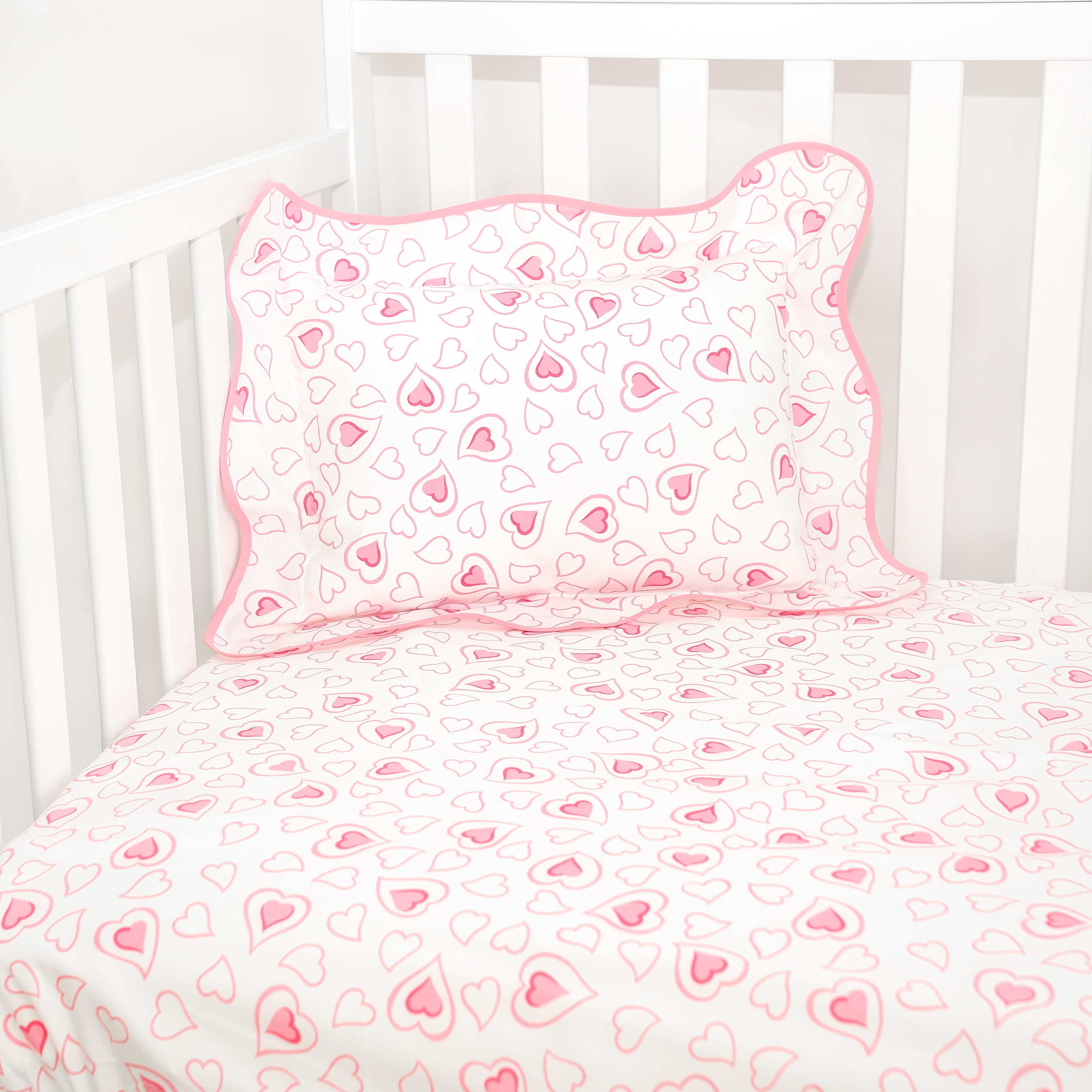
In the company’s archives are early examples of the popularity of mixing and matching and of how Porthault’s prints so often reflected the personality of their clients. The Duchess of Windsor commissioned Porthault’s Carnation design in yellow and mixed it with Hearts, Clovers and other florals for her homes in France; in Paris, the Windsors planted a garden of yellow flowers to reflect the blossoms on their Porthault linens. Charlie Chaplin loved Porthault’s prints and mixed several florals with blue Hearts to achieve his own look; from his home on Lake Geneva, he inspired Porthault’s popular Chardons Luzerne. Diana Vreeland understood the designer appeal of Porthault, and her unique and vibrant style was reflected in her focus on red and her mix of Porthault’s Feuilles and Cachemire prints.
Similarly, Jacqueline Kennedy Onassis (pinks and greens), Catherine Deneuve (pinks and lavenders), Grace Kelly (blues and yellows) and Estee Lauder (blues and greens) all embraced the chance to mix and match their linens and to create stories that reflected the mood and colors they loved. Today, our clients do the same!

Tips for Mixing and Matching
* Start by choosing a focus color- What is your favorite color? What mood would you like to create?
* Does your room suggest a color by its current décor?
* Potentially add one or two accent colors to create dimension, but remember to let the focus color dominate
* Choose prints that either include or highlight your focus color
* Be aware of the consistency of color value (lightness or darkness) so that all your prints sing together harmoniously
* Play with scale within your focus color – small prints can live comfortably with larger prints if their colors and values are aligned
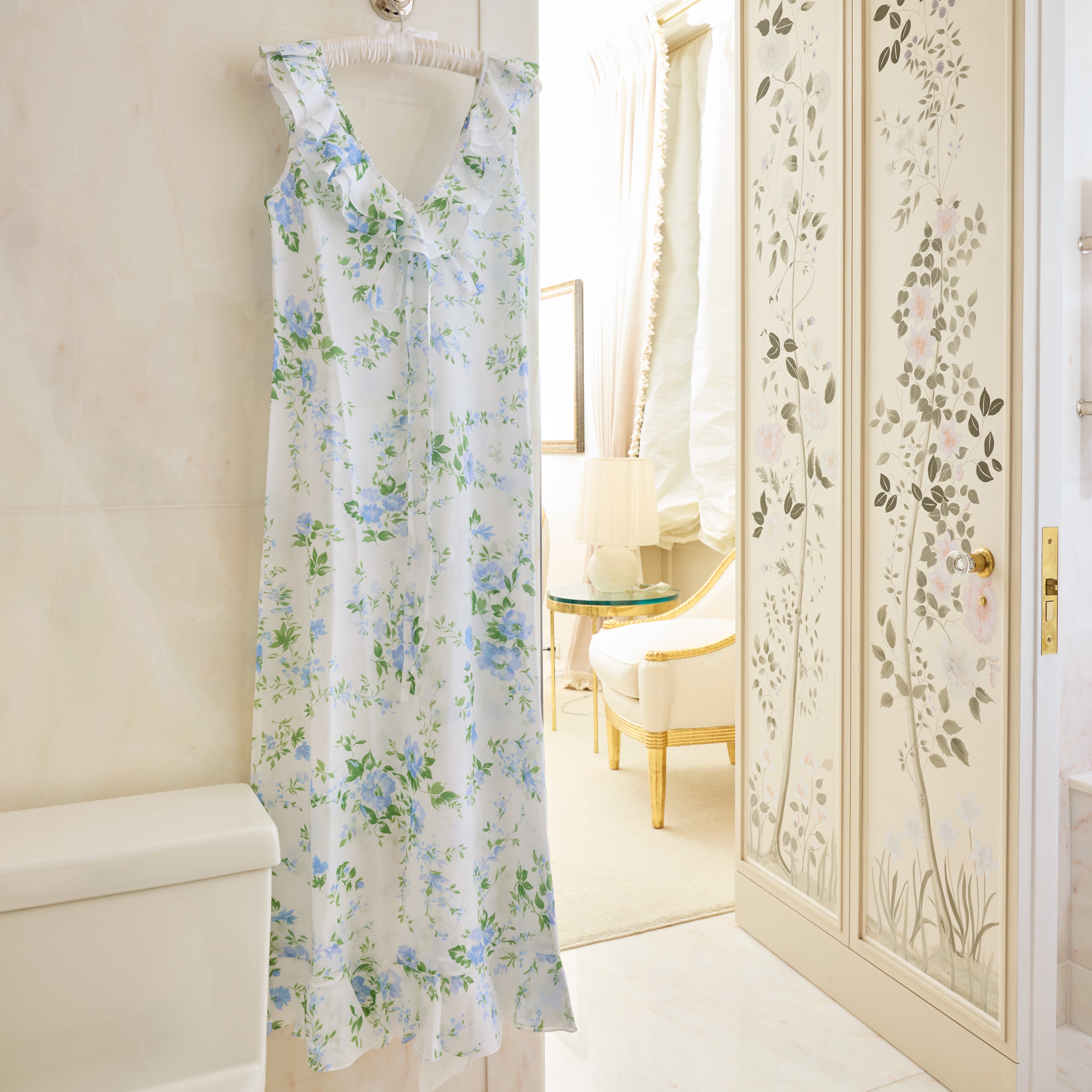
* You can ‘frame’ your colors with white (for example with pillow shams scalloped in your focus color ); this allows breathing room for the various prints within your focus color
* Dots and stripes are neutrals and can be worked into your mix just as solids can be – as elements against which your prints will shine
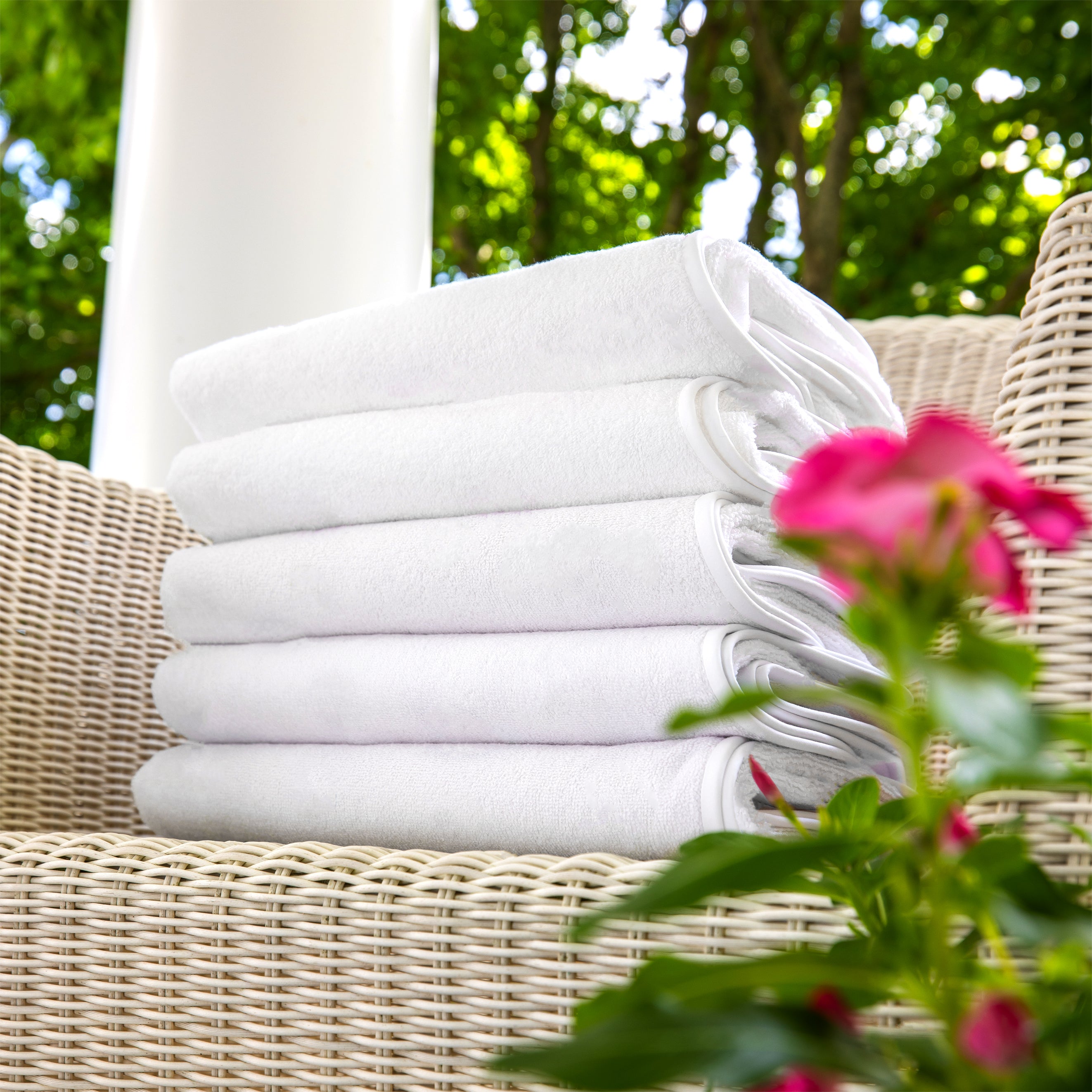
* If you prefer white, add a pop of color that reflects some aspect of your room décor, flower arrangement, window view or mood of the moment; adding a subtle or dramatic print (for example with boudoir pillows or Euro shams) to a predominantly white palette adds personality and life.